
After the decision was made which 3rd-party platform to use (Navattic) it was time research how best to incorporate the demo into our users acquisitional journey.
I conducted extensive analysis amongst both direct and indirect competitors and also spoke with reps from Navattic to gain further insight into their recommended best practices. This research along with collaboration with our PMM gave us an initial user journey and also the key verticals within our product offering that should feature in the demo.
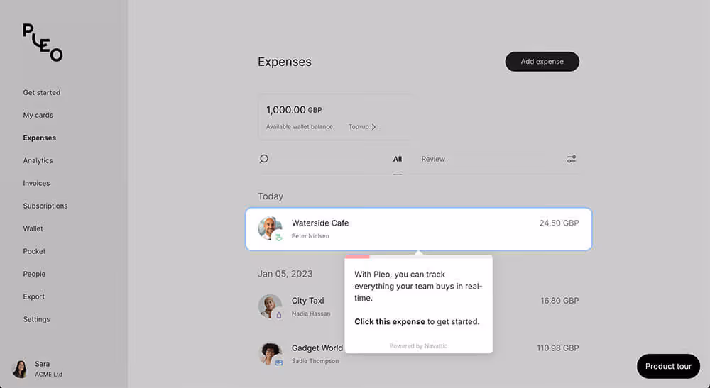
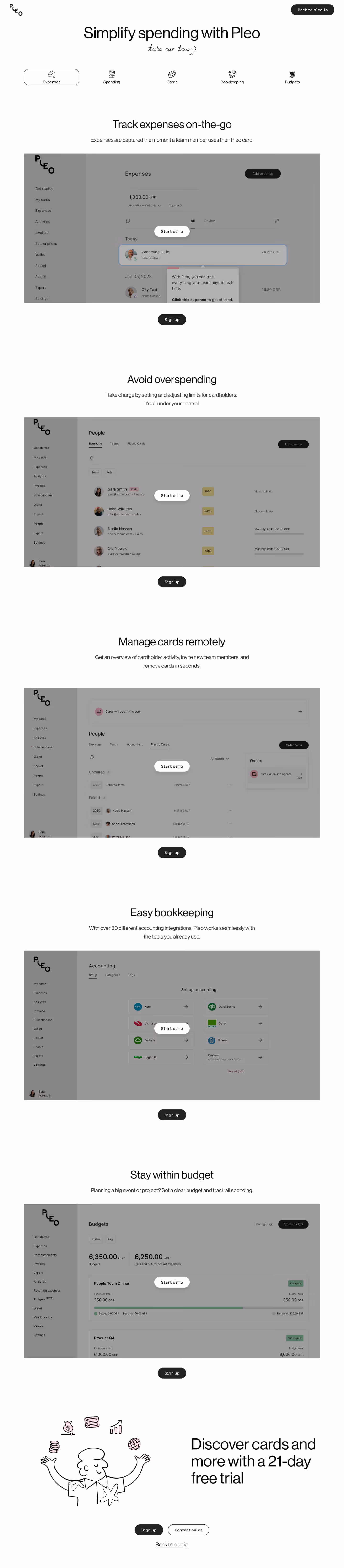
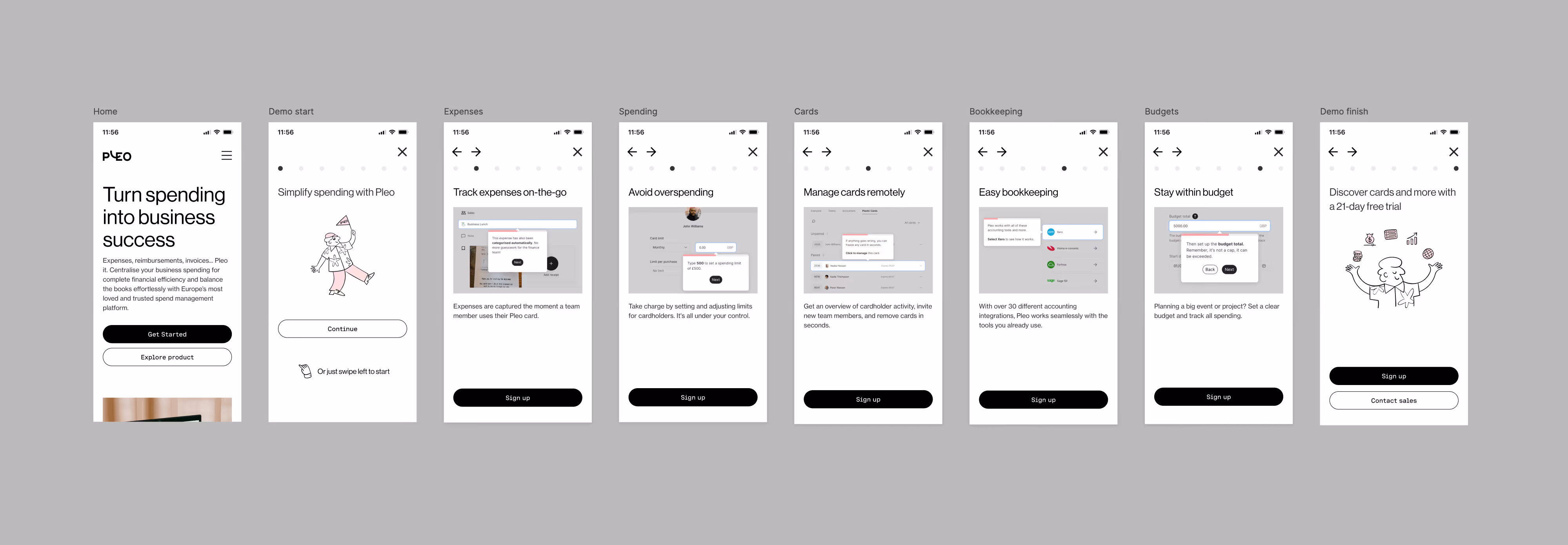
Part 1 - The demo: The Navattic platform allowed us to include separate journeys for each vertical (Expenses, Spending, Cards, Bookkeeping, Budgets). This would be monitored via analytics to see how each journey performed.
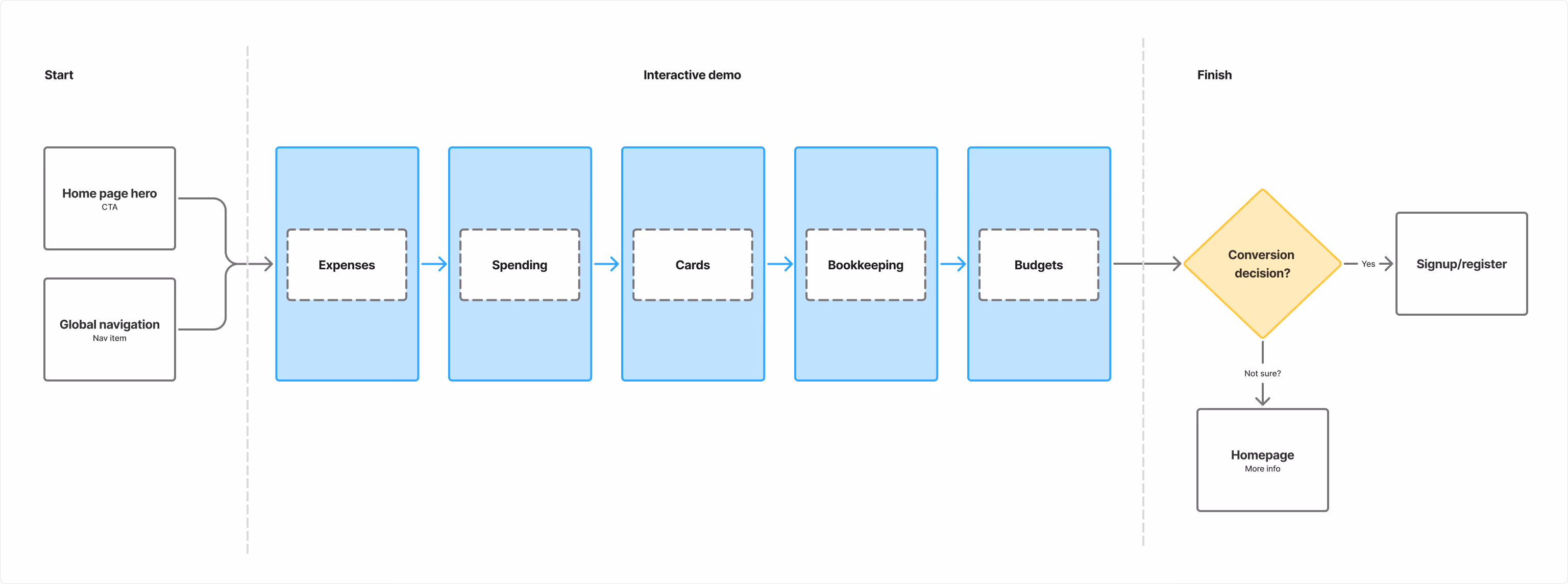
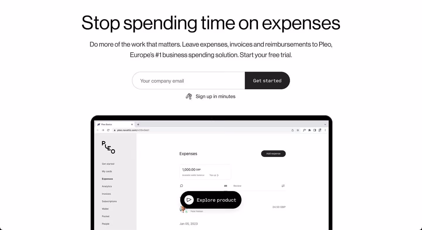
Part 2 - The user journey: From the competitor analysis it was clear I would need to design a new homepage hero experience to guide leads to the new demo.
I tested several different hero options using Maze as the usability testing platform. These options were narrowed down and A/B tested.
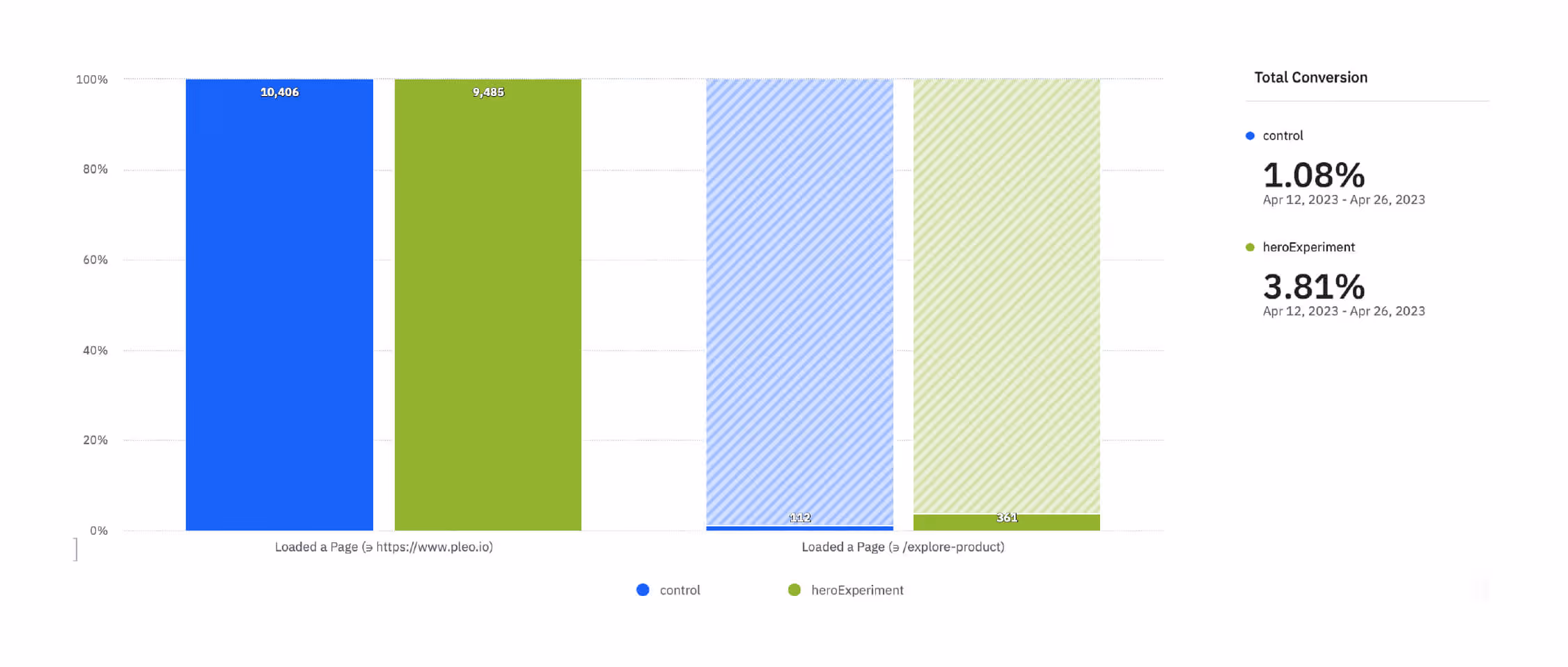
The testing led to a validation of my initial hypothesis that the demo should be accesible via both the main site navigation and also through the home hero.
After the successful roll-out of the MVP we identified some areas by analysing our data we knew we needed to improve:
As mentioned before, a huge constraint of this project was that the Navattic demo experience on mobile wasn't great. For this reason the MVP had no mobile version of the demo, we needed to address this as data showed we were loosing leads here.
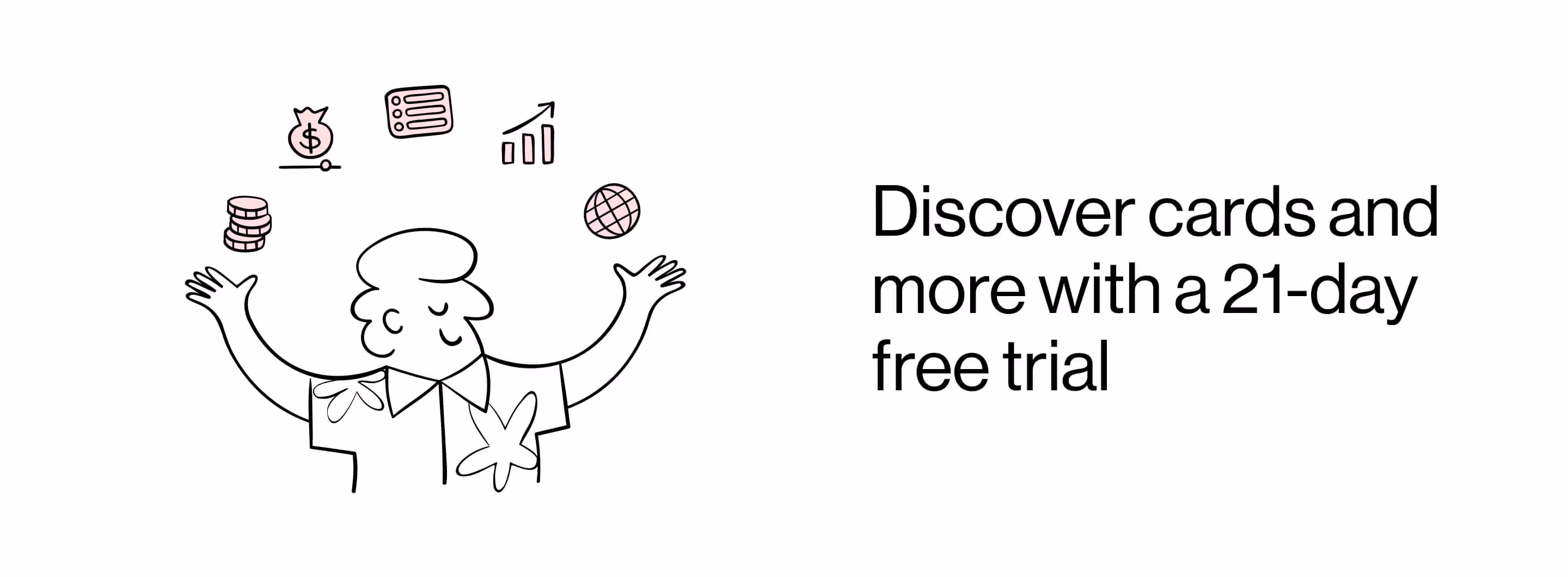
I arrived at a solution that used short videos for each section with accompanying copy to give an overview of each of our product verticals. Not exactly perfect, but a significant improvement.
This solution led to an approx 15% increase in traffic to the interactive demo.
We also saw that within the demo itself users were not always aware that the demo contained several different flows for different parts of our product. After looking at the analytics we could see that this was down to the UX within the demo, so I looked at how to fix this.
After looking at and testing several different options I went with breaking the demo down itself into it's various scetions and allowing the user to navigate between them. This allowed users to see our key offerings far more clearly and navigate between them with more confidence.
This new approach led to an approx 10% increase in time spent on the interactive demo (users were exploring more) and a 12% increse in 'first presentment' vs the MVP.
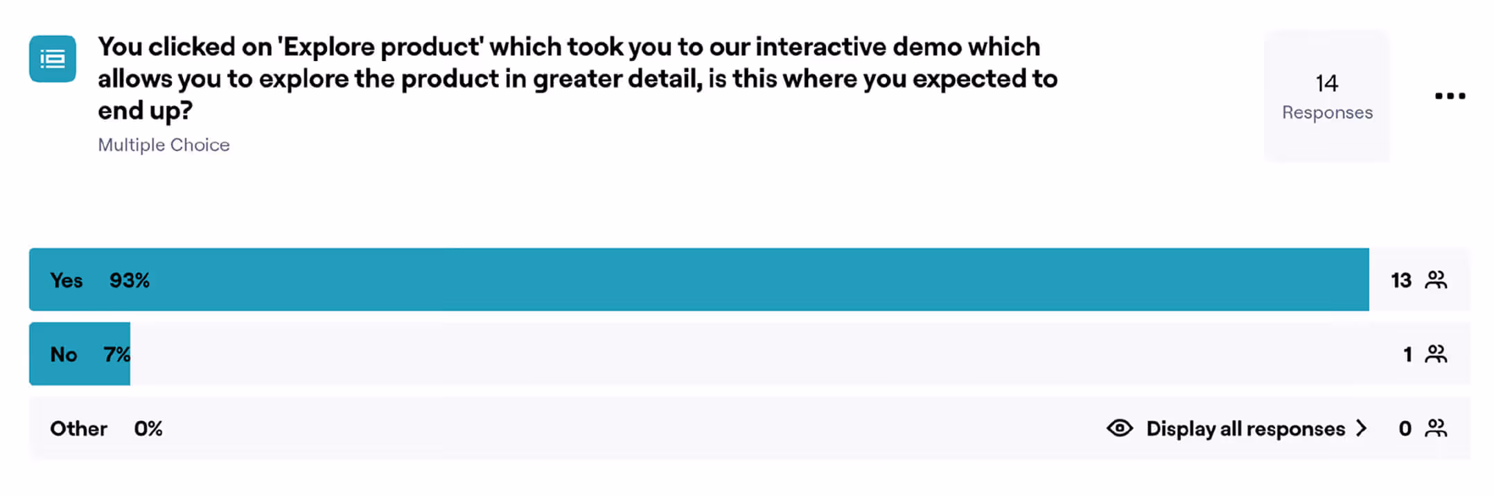
The Interactive Demo project proved to be a powerful lever for identifying and nurturing high-intent leads. The project validated that product-led education successfully qualifies traffic before they ever speak to sales. In simple terms: if you let potential customers discover the value your product can bring them, then they are much more likely to pay you to use it.
The most significant impact was on lead quality. Visitors who engaged with the demo had a 35.6% conversion rate in the KYC (Know Your Customer) flow, compared to 13.7% for those who didn't.
Visitors who reached the demo page were far more likely to progress to "first presentment" (active usage) within 30 days (0.832% vs 0.043%).
The design changes to the Hero section increased traffic to the demo page significantly, from 1.14% (Control) to 3.82% (Test).
The project was a success, the numbers look great, and they were, but that doesn't tell the full story.
The use of Navattic was initially meant to be a proof-of-concept. If the initiatve was deemed succesful then we could look at investing significant time and effort into building a more bespoke and on-brand demo experience that could drive acquisition even further. But that never happened. Why? Well a mixture of crowded roadmaps, never ending org changes, curveballs, brain-farts, team changes, priority shifts and the usual chaotic scale-up maelstrom meant that we never got the chance to take it further. This keeps me awake at night.
Interactive demos have a shelf life. The conversion rate dipped as the demo UI drifted away from the live product. A maintenance strategy is just as important as the launch strategy. Lesson learnt!

"I was lucky to have Simon on my team. He’s a rare kind of person who can energize a room and ground it at the same time. I don’t fully understand how that works, but teams were better when he was around."
Dima Bykov Product Design Director Pleo