
When I joined the Web/PLA team at Pleo, our operational model was unsustainable. We were functioning as a reactive delivery team, constantly bottlenecked by ad-hoc page requests from multiple international stakeholders. As the sole designer, I ran the risk of being caught in a cycle of repetitive production work rather than strategic product building.
Our challenge had two main parts: we needed to preserve global brand consistency across diverse, locale-specific content requirements, and we needed to transition the team’s perception from 'page producers' to a high-impact product function. To achieve this, I had to create a system that maximized output while minimizing my direct involvement, thus empowering the organization to self-serve without compromising design quality.
Building a design system with limited resources isn’t just about components, it’s about managing the trade-offs between speed, scalability, and quality. My strategy was to design the system to be self-governing (or mostly self-governing, let's not get carried away here).
I couldn't afford to be the bottleneck. If every new page required me to design it then I would never be able to do more strategic and valuable product work.
Creating a more self-serve system would require education. I realized that educating stakeholders could be a fragile strategy. If I trained a PMM on Figma and they left the company, that knowledge vanished.
We couldn't sacrifice quality for velocity, but we also couldn't allow a slow, traditional QA process to kill our momentum.
To solve the bottleneck, I moved away from bespoke production and toward systemic enablement. The goal was simple: design myself (mostly) out of the critical path while increasing the overall quality of our output.
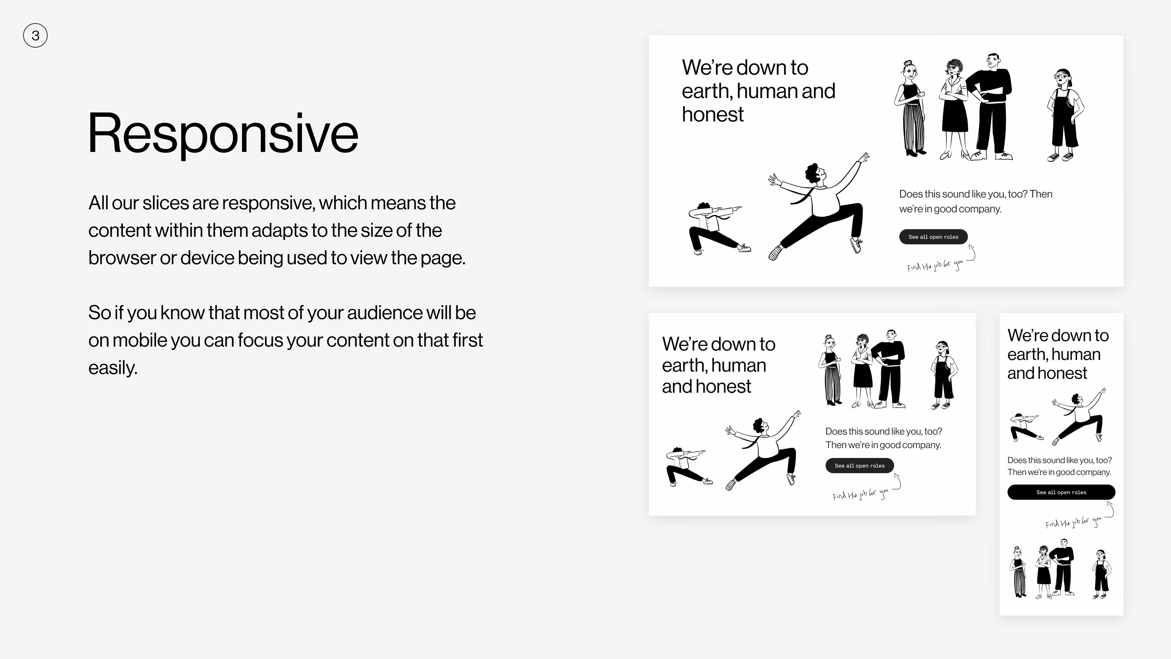
Every content block, from CTA cards to complex grid layouts was audited and mirrored (with all corresponding options and variants) in our Figma library. Stakeholders could now easily drag-and-drop blocks into pre-defined templates for desktop/tablet/mobile to create their pages and build their narratives.
To deal with team churn and stakeholder education, I moved away from individual training toward in-context governance. I created a master template file in Figma that served as a living manual.
Usage guidelines, layout constraints and asset requirements were all part of the template file.
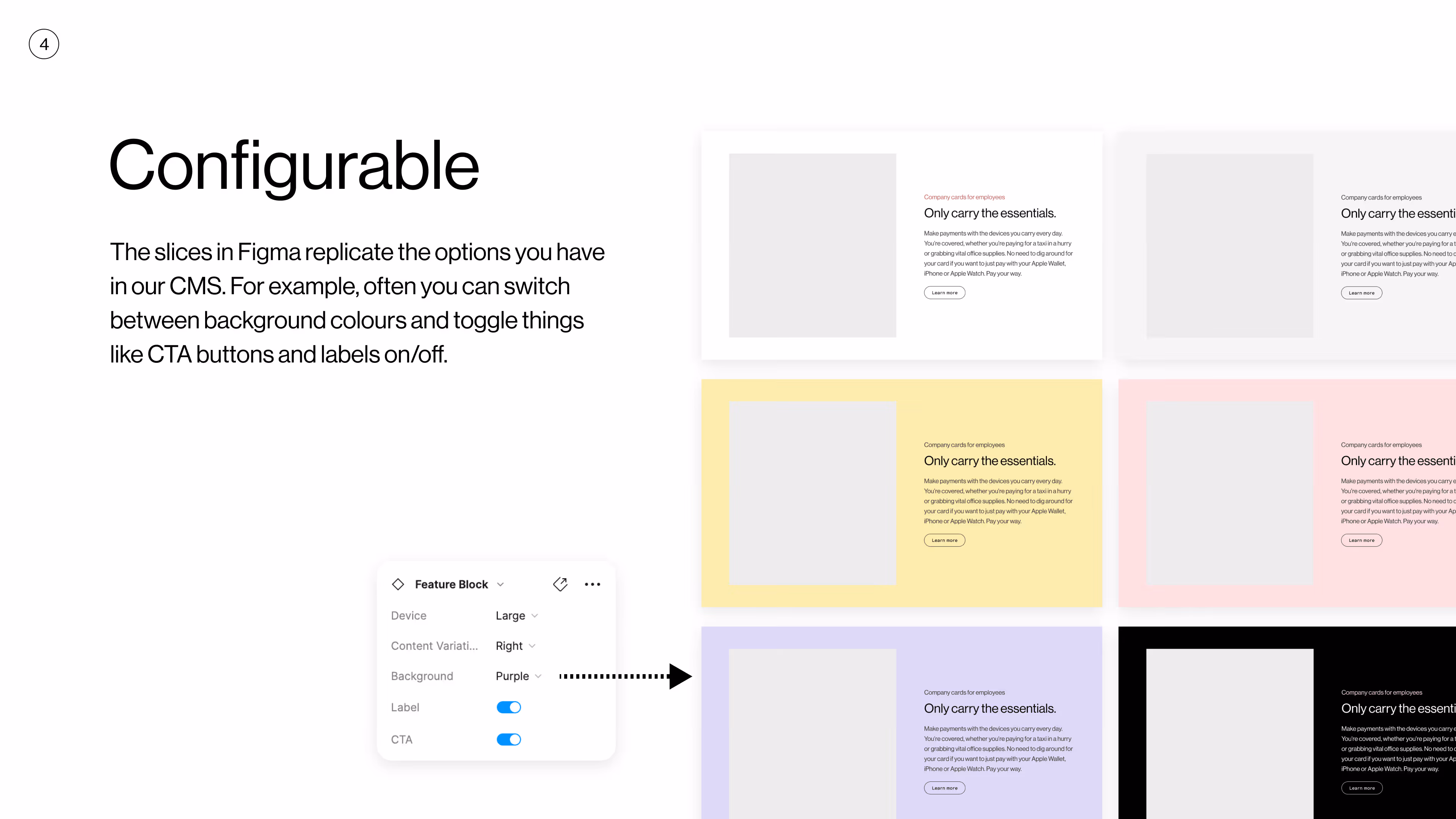
If a stakeholder joined the team later, they didn’t need me to explain how it all worked (although I was always there to help if needed) the system taught them. If a content block (or 'slice' as we called them) couldn't be used in a certain way, then the Figma variant simply didn't allow it.
I ensured quality was baked in. My QA time was then reserved only for the final sanity check before publication, turning a lengthy design review into a 10-minute check.
Making your website or product accessible isn't just the right thing to do or a nice-to-have if you've got the time, it also affects the bottom-line.
If customers who have accessibilty issues (I count myself in this category, I have cognitive and neuro-diverse issues) can't use your site properly then they (quite rightly) will leave.
I standardized interactive patterns (like keyboard focus states) as global styles. These were applied automatically to every new component, ensuring that everything we produced had a consistent experience for customers using keyboard navigation.
Any animations and/or transitions were kept to a tasteful minimum. Animations should aid the user as they absorb the story you're telling, they shouldn't be the focus. Users who specify reduced motion in their browser settings shouldn't see any animations (or very little).
Videos would either play optionally or if they do auto-play then there should be no audio, nobody wants our loud video forced upon them.
The success of this system wasn't measured by the number of components created, but by the operational freedom it gave the company. By systematizing our web presence, we shifted from a reactive delivery model to a proactive, scalable framework.
By mirroring the CMS in Figma and providing self-serve templates, we drastically reduced the idea-to-live lifecycle.
Marketing and regional teams gained the autonomy to prototype and launch pages in hours rather than days, without waiting for a dedicated design sprint.
With 4 years of evolution and multiple international locales, the risk of UI drift was high. The design system acted as an automated safeguard.
Every regional site now shares a unified visual language and accessibility standard, ensuring a premium, trustworthy brand experience for all users regardless of their location.
As a sole designer, my time was the most constrained resource.
I managed to shift 70-80% of my weekly workload away from production-heavy page building and toward high-impact strategic projects and product design work within the PLA team.
One big lesson I learnt is not to rely too heavily on any one proprietary design tool as the 'single source of truth' this can create a potentially dangerous silo trap.
Towards the end of my time at Pleo the costs for Figma became such that edit access was restricted to designers only. This meant that the self-serve template within Figma couldn't be used by non-designer stakeholders. Which sucked.
But you can't dwell on these things you have to adapt, so we managed to use a stripped down version in Miro that at least let key stakeholders continue with self-serving their own page creation. Another lesson learnt!

When Simon took over the project, the website had recently been migrated and still had plenty of room for improvement, as it was in the early stages of the design system. Simon’s seniority shone through quickly, and the design system matured rapidly under his watch.
Not only is Simon a world-class designer with an incredible eye for detail and impeccable Figma specifications, but he also operates comfortably at a higher strategic level within the team. Often creating tickets with clearly defined requirements, complete with business acceptance criteria, and frequently took the lead in sprint planning.
Juan Manuel Incaurgarat Tech lead PLA team