
The Pleo homepage had not seen a major update in three years. As the company strategically moved "upmarket" to target mid-market companies, our digital presence lagged behind.
From previously conducted user research we knew we faced significant misconceptions in the market, specifically that Pleo was a bank or merely a tool for small, work-related expenses or simply a "credit card" provider rather than a holistic spend management platform. We needed to shift the narrative to prove we were a credible, professional financial tool for larger organisations.
A homepage, like any page doesn’t exist in isolation. It is of course one step in a wider acquisitional user journey.
In collaboration with our CRO team I looked at our analytical data and it was clear that our main source of acquisition came from social ad campaigns on mobile devices. Users would by and large see an ad whilst scrolling on social feeds then click through to a specific campaign landing page. They would then return later on desktop either by typing the main Pleo URL into the browser or by searching for Pleo.
Our analytics data combined with anecdotal data from speaking with customers also showed that the ability to integrate existing bookkeeping and user management software into our product was a key factor in decision making.
Put simply the heart of this project was information, or more correctly: communicating the right information at the right time so potential customers could make an informed decision.
Some of the core ares we focused on where:
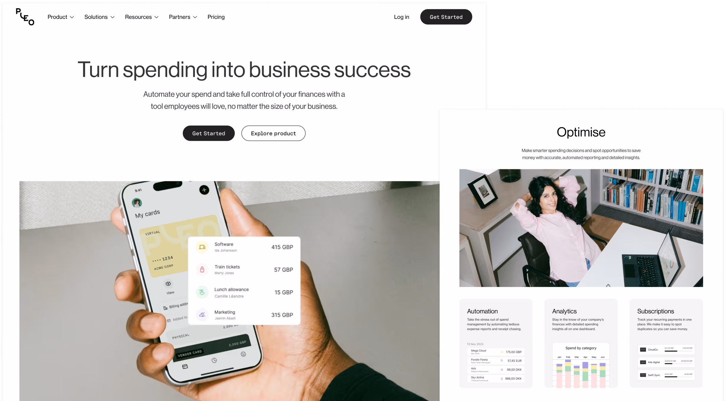
I had already designed and tested out a new hero design as part of an interactive demo initiative. This new hero not only tested well for increased product awareness but also allowed us to introduce the new product demo (via CTA) into the acquisitional flow. We brought this new hero into the new homepage project (with a few tweaks to the CTA pattern) incorporating a video that give a tease into the product dashboard without a cognitive overload.
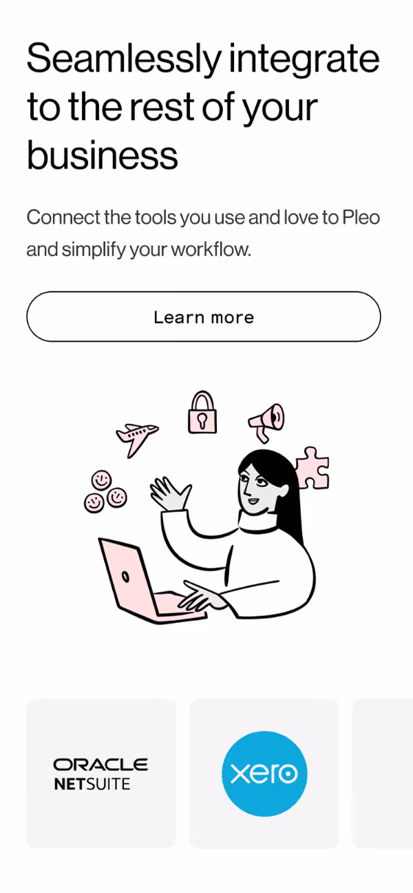
As previously mentioned, integrations are a key deciding factor for potential customers. We gave this more prominence than on the previous homepage, allowing leads to see a more comprehensive overview of the integrations we offered.
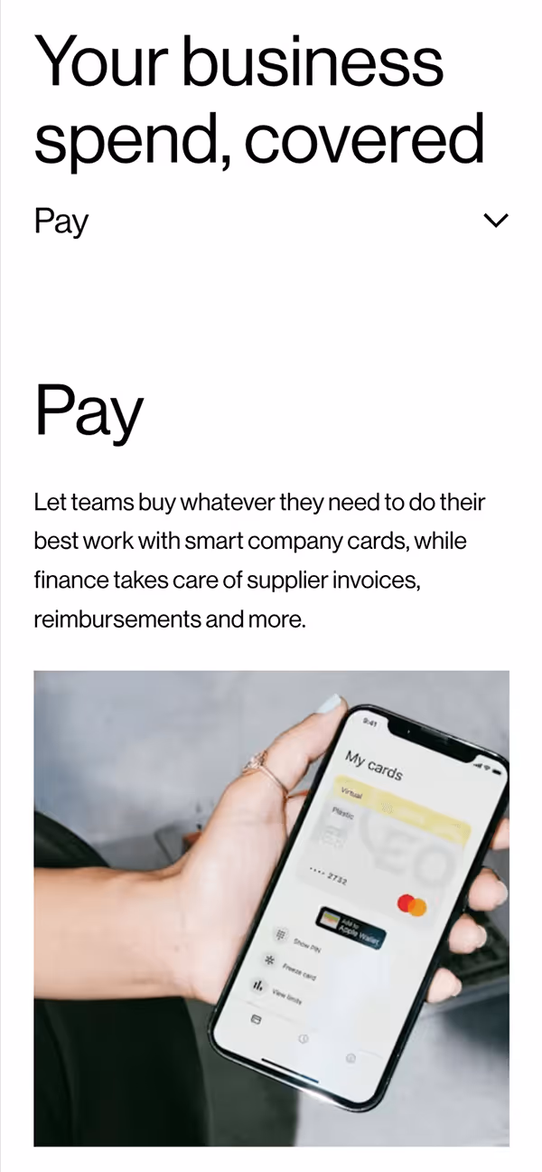
Centring the new narrative structure on the value proposition pillars of "Pay, Manage, Optimise" moved us away from a feature-list approach to a solution-oriented story that would hopefully encourage potential customers to discover more and then see themselves in the story we were telling.
This was a cross-functional effort. I worked closely with:
We used a soft rollout method rather than a standard 50/50 A/B test to mitigate risk.
The new homepage successfully refreshed our brand while improving performance in key areas. The English (EN) test attributed 30% increase in conversion +£142K in MRR pipeline, indicating a positive lift in conversion quality. In Germany (DE), reordering sections to "lead with clarity" resulted in a +24% uplift in predicted Value-Add ARR per user.
UK homepage tests showed a directional uplift of +15% in Average Value per Visit (at 63% confidence), validating our "lead with product clarity" strategy.
We successfully rolled out to 100% of UK traffic followed by successful rollout to all markets with no reported negative impact on conversion rates, meeting our primary "do no harm" success criteria.
The strongest quantitative data (the DE and UK value uplifts) supported our design hypothesis that showing the product early ("lead with clarity") drives better downstream value than hiding it behind generic copy.
While we protected CVR (Sign-up Started), the real value of the redesign was seen deeper in the funnel (Pipeline ARR). Measuring success solely by "clicks to signup" would have undervalued the impact of the brand repositioning.
Attempting to validate complex narrative changes in low-volume markets (like Sweden or Spain) via A/B testing proved difficult. Future structural tests should focus on high-volume locales first.
We treated the homepage as a performance surface, running continuous A/B tests on specific slices, hero copy, trust blocks, and CTAs
We planned to embed the new narrative ("Pay, Manage, Optimise") into other high-intent pages, such as Pricing, Book a Demo, and Product Demo pages, to ensure consistency across the entire user journey.
We continued to refine the localised versions of the homepage, adapting the narrative to fit local market segments better where the initial "one-size-fits-all" translation didn't statistically land.

"Anyone who’s worked on a SaaS website knows how hard it is to get marketing, sales, product, design, and engineering to agree on anything. They see the world differently. Simon somehow did it, over and over, by keeping everyone focused on one thing - helping customers understand what we sell."
Dima Bykov Product Design Director Pleo