
As Pleo entered a period of hyper-growth, our recruitment needs scaled rapidly, but the hiring experience on our website wasn't able to keep pace with this growth. The legacy careers page acted more as a bottleneck than a bridge, with limited listings and a fragmented experience that forced users onto a third-party platform.
We needed to transform a static, externalized job board into a cohesive, user-centric destination that could support our aggressive hiring goals in multiple markets while providing a seamless, on-brand search experience.
A major technical constraint was the need to migrate job listings gradually from our third-party platform to our CMS without disrupting the hiring pipeline. We couldn't "flip a switch."
This meant the UX had to support a hybrid state: the interface needed to seamlessly aggregate listings from two different backends while maintaining a unified look and feel for the candidate. I designed a unified search layer that normalized the data from both sources, ensuring that whether a job was hosted internally or externally, the candidate's filtering and application flow remained consistent. This approach allowed us to migrate listings at our own pace while preventing the user experience from degrading during the transition.
We defined a clear scope that balanced immediate hiring needs with long-term scalability.
To ensure the redesign addressed both user pain points and operational inefficiencies, I conducted a dual-track research phase that considered both business and candidate priorities.
I met with the hiring team to understand their pain points. I learned that (amongst other issues) they were spending hours editing candidate information as the application form functionality on the 3rd-party platform had limitations. This wasted time and made data sometimes unreliable.
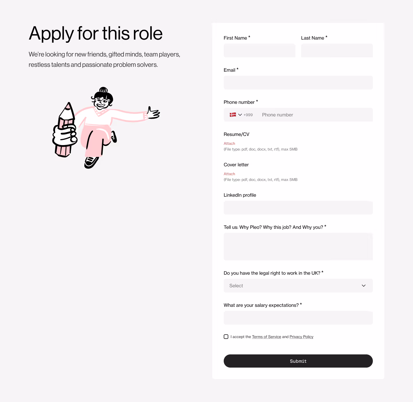
I walked through the existing application process from a candidate's perspective. I identified three critical drop-off points: the lack of job search filters (making it difficult to find relevant roles), the jarring transition to an unbranded external site (breaking trust), and the lengthy application form.
I analyzed several industry peers who were hiring at a similar scale. I looked for patterns in their "Jobs" navigation, filter logic (location vs. role vs. department), and how they handled the "Apply" CTA.
The problem wasn't just a lack of search features, it was a trust gap. Candidates were being redirected to a third-party site that didn't feel very "Pleo" causing them to doubt the company’s legitimacy or our culture. The new design should reinforce our culture not deminish it.
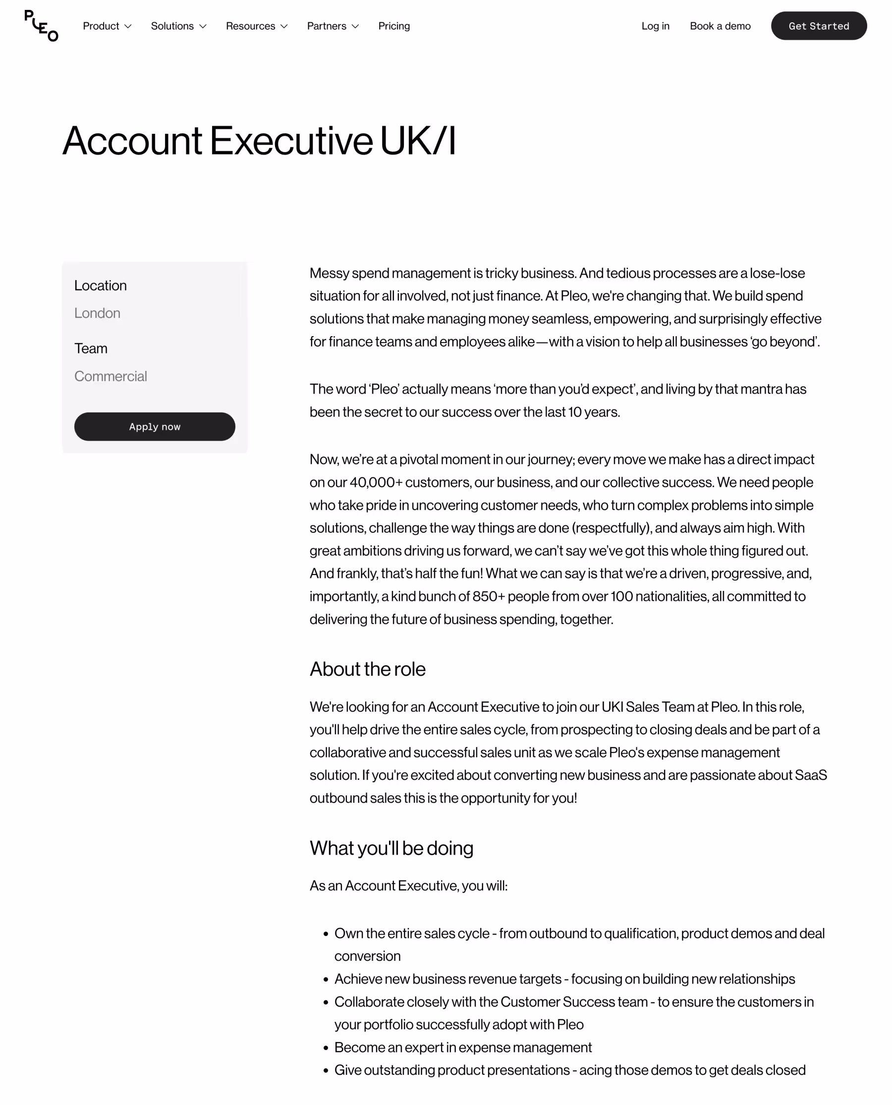
To bridge the gap between the company's growth objectives and our candidate’s needs, I designed a scalable, on-brand careers hub that serves as a single source of truth for all job openings. The design strategy was built on three core pillars:
I added new components and patterns to our design system that would not only be used on the careers section but could be easily be used in other areas where relevant. We removed the not-so-great transition to the 3rd-party platform that previously existed. The application flow now feels like a continuation of the brand, not a checkout page on a third-party site.
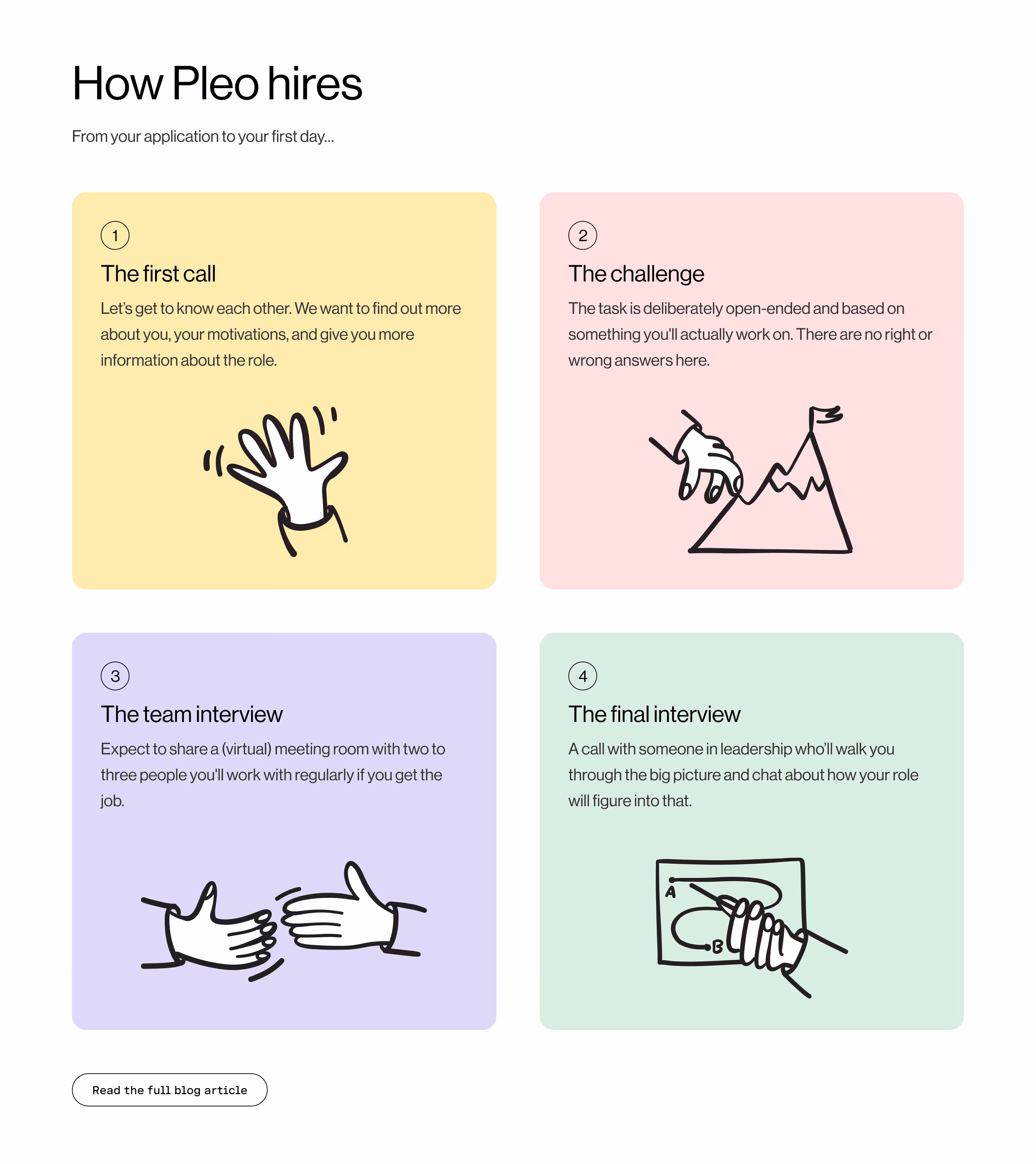
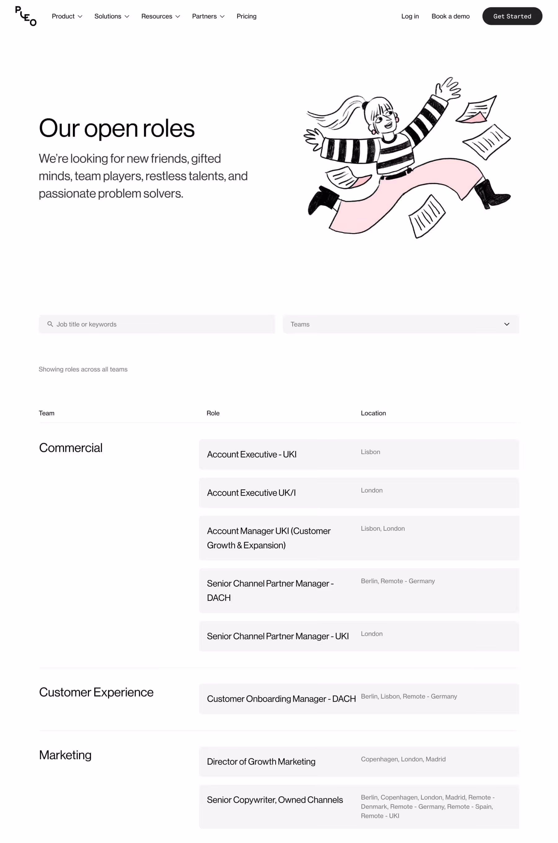
We implemented a unified search layer that normalized job data from both our legacy 3rd-party platform and our own CMS. To the candidate, the experience is seamless, they don't see the technical divide, they see a fast, consistent list of jobs.
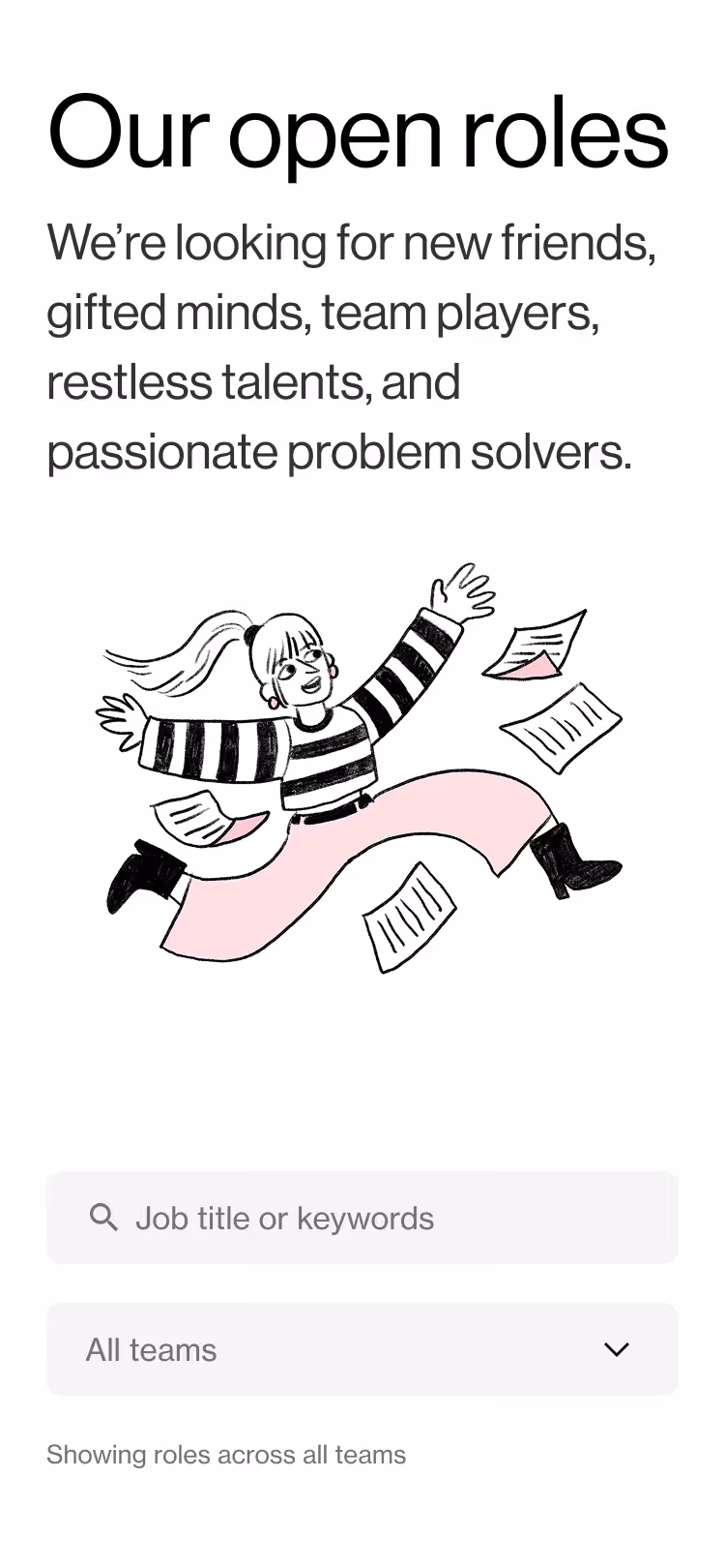
I moved away from a static list to a search model. Candidates can now filter by location, role, and department. This not only reduces search fatigue but increases conversion by getting candidates to the right role quicker.
Big shout out to the in-house branding team at Pleo who designed us a whole new set of illustrations and icons for this project ❤️
By bringing the job board in-house and optimizing the UX, we saw a significant improvement in how candidates interacted with our open roles. We also saw a big jump in organic traffic from search engines with all jobs now within our own website.
By removing the dead end of a third-party redirect, we reduced abandonment rates significantly.
Implementing the new category and location filters allowed candidates to find relevant roles faster, leading to a higher conversion rate per visit.
Internal tools (such as a careers page) deserve the same care and attention as another other area of the website. Why? Because it's not just designing a page or a flow, we were optimising the company's internal infrastructure to support the business-critical goal of acquiring new talent.
It was also kinda cool to bridge the gap between design and other departments (specifically talent acquisition) to show how design has real value.


Simon is a talented designer who combines his years of experience with a constant curiousity of new trends and tools, for example, Simon was one of the first designers I know who explored the options of AI.
Robert Fransgaard VP of Design Pleo