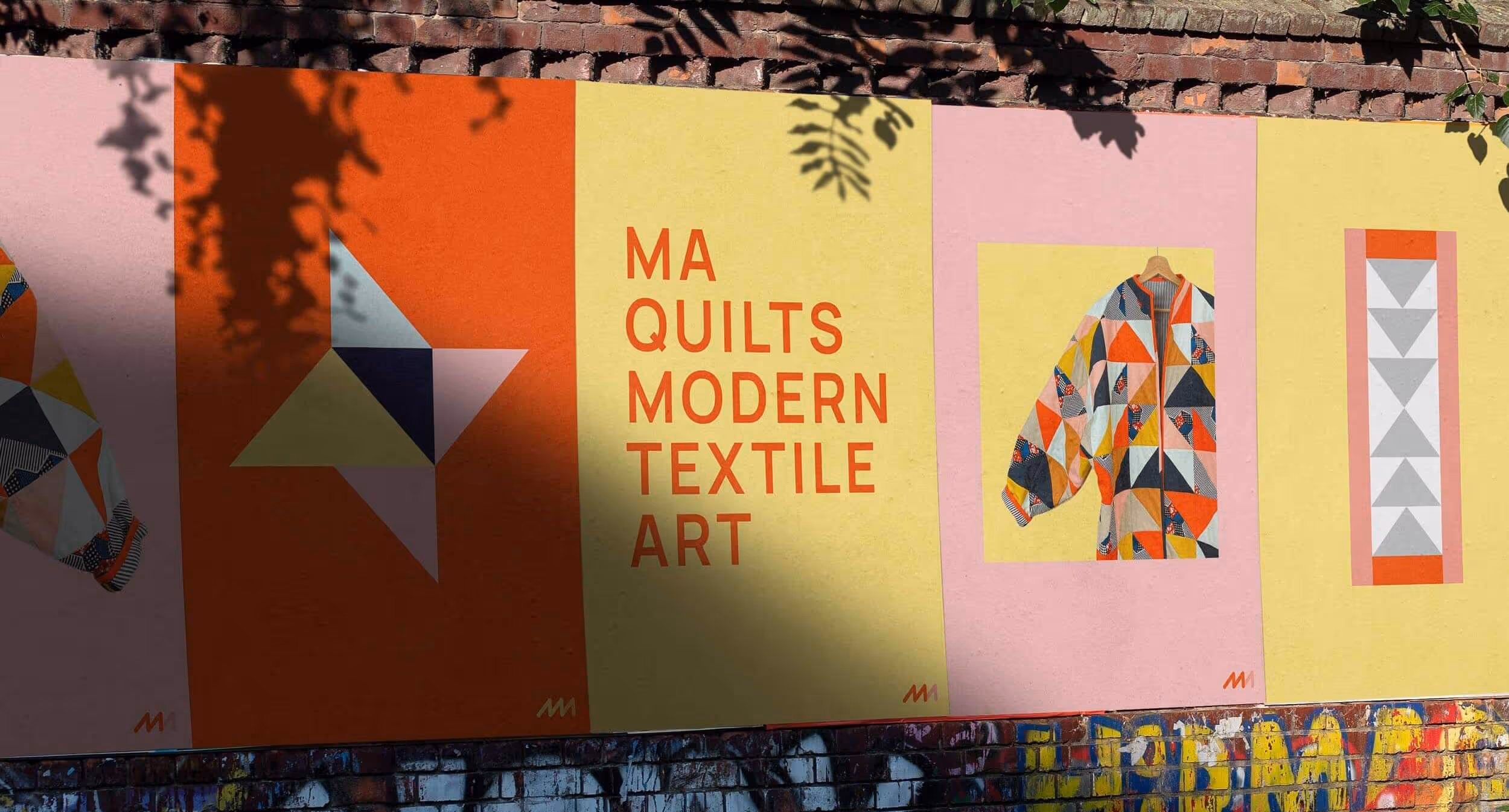
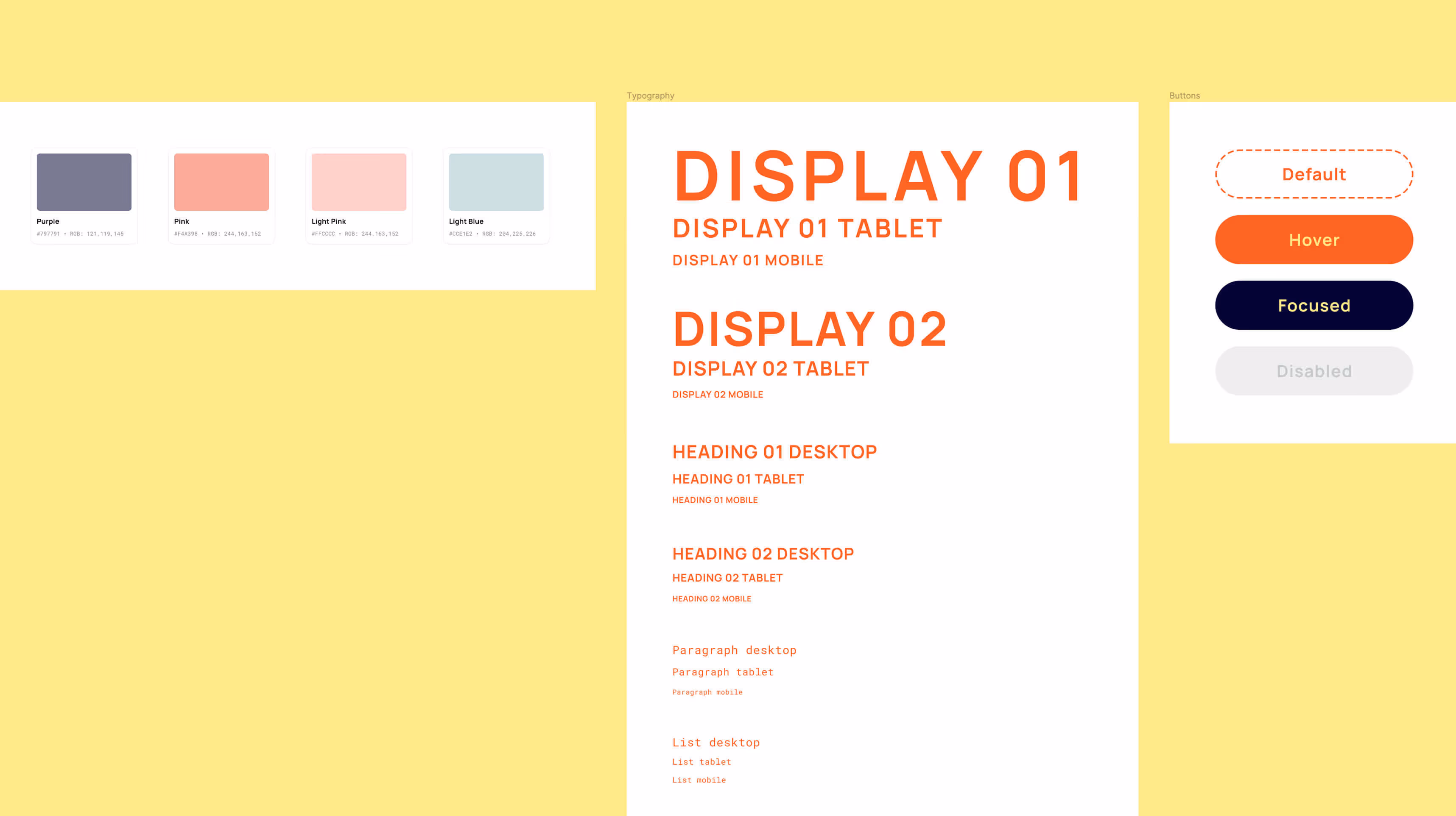
I started by putting an extensive colour palette together using colours from the fabric used in the quilts. I then played with these colours and how they worked with each other until I had whittled the palette down to a refined set, including a primary red and yellow with complimentary blues, pinks and purple.

Modernity is at the heart of MA Quilts and we wanted this to be reflected in the brand typography. After experimentation with different combinations and styles of typography we went with a font pairing of the sans-serif Manrope in bold as our primary typeface and Roboto Mono in regular as our secondary.

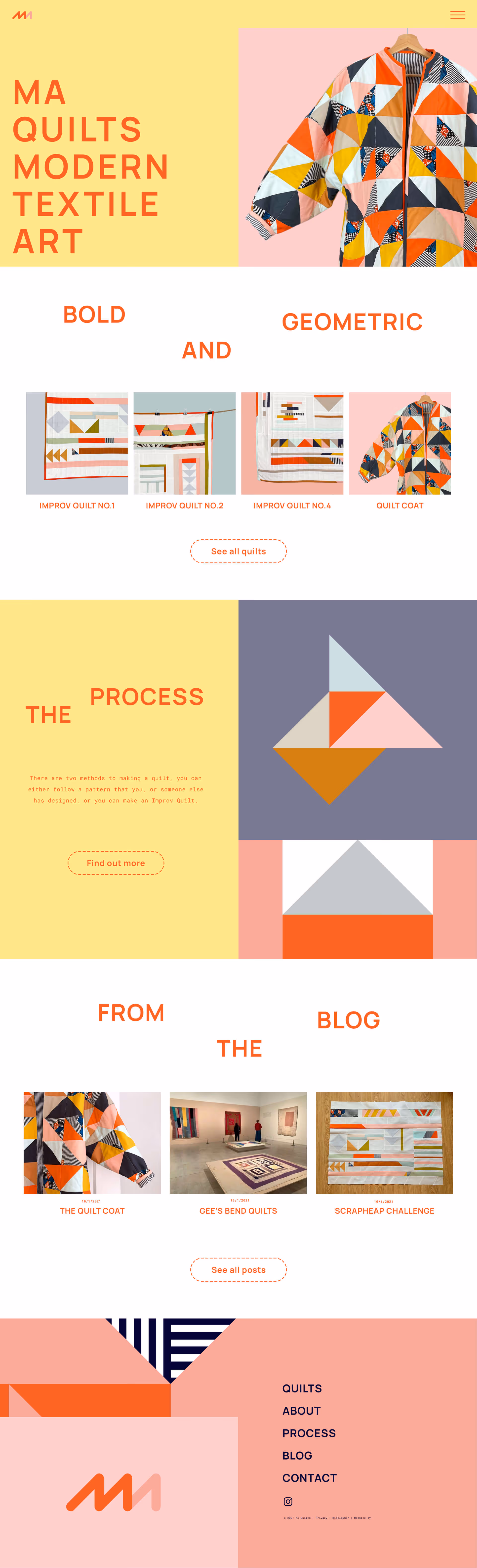
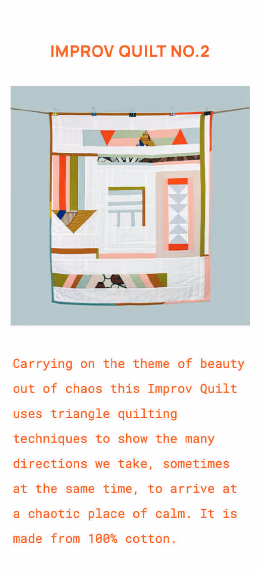
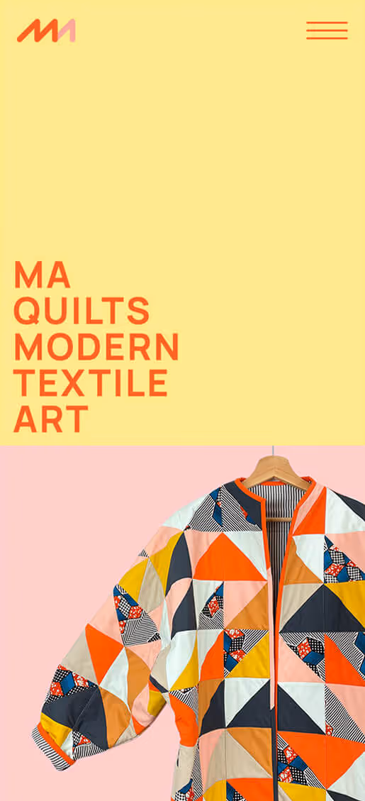
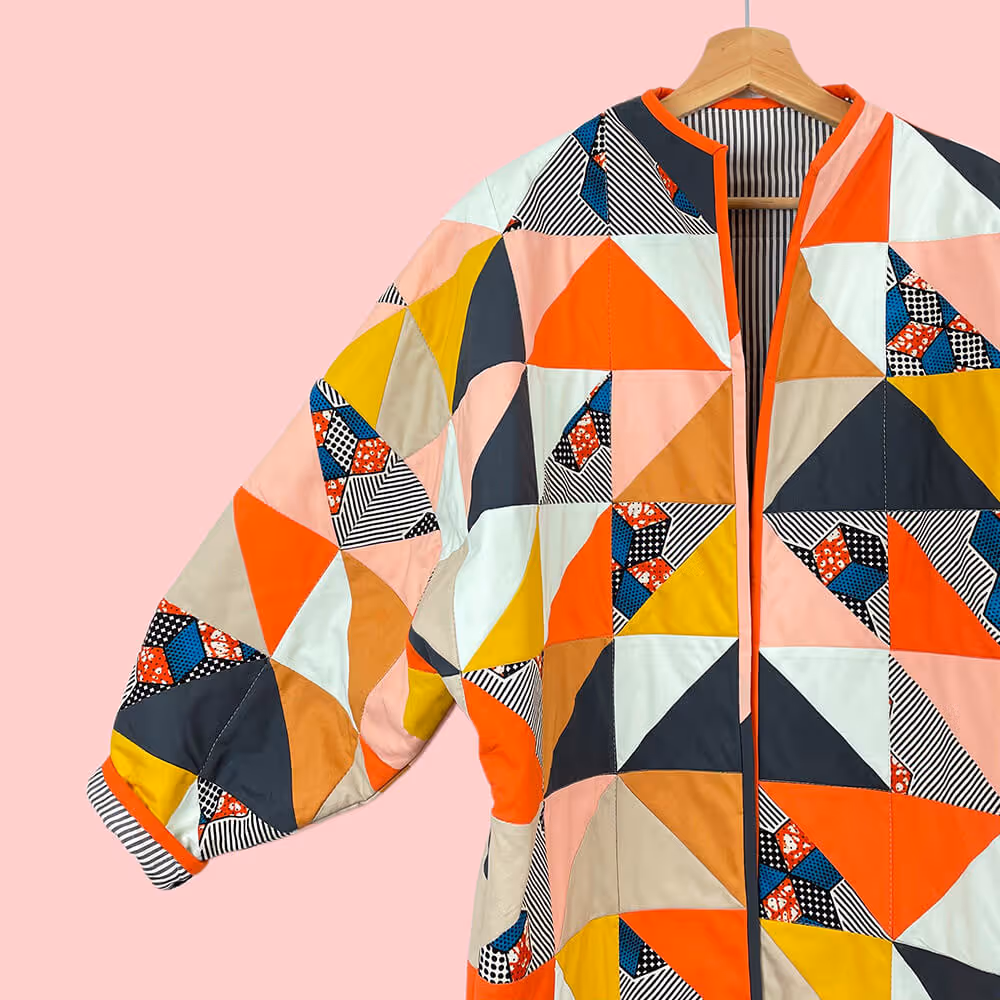
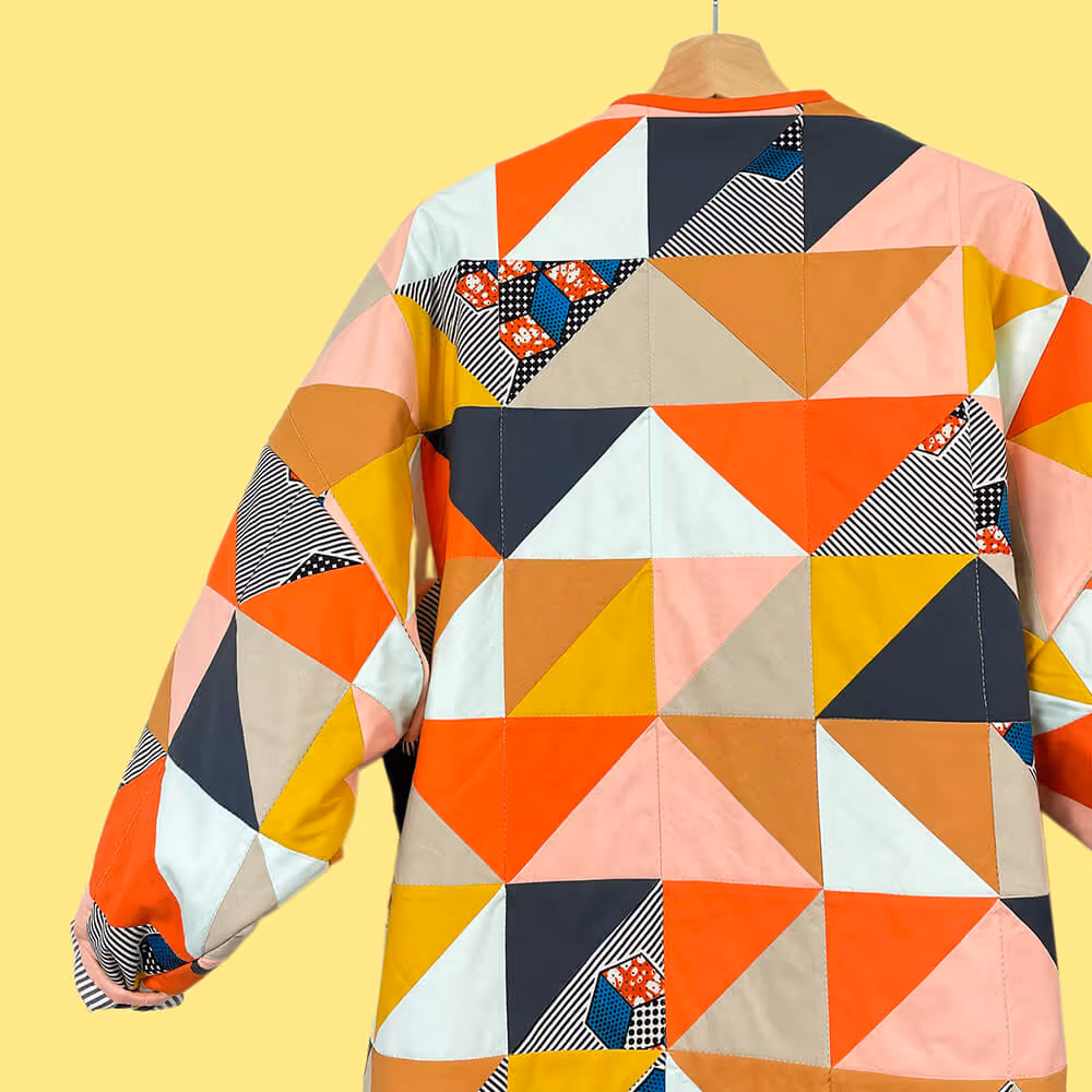
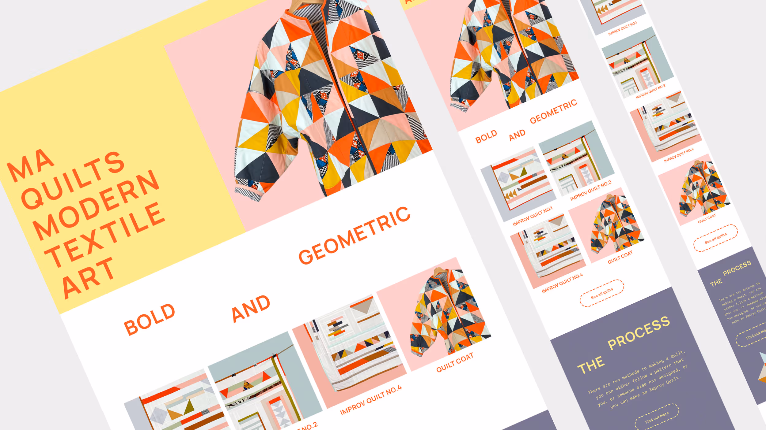
The product photography needed to embody the bold, graphic and geometric nature of the brand. Images are kept simple with bright bleached out colourful backgrounds to emphasise the product.
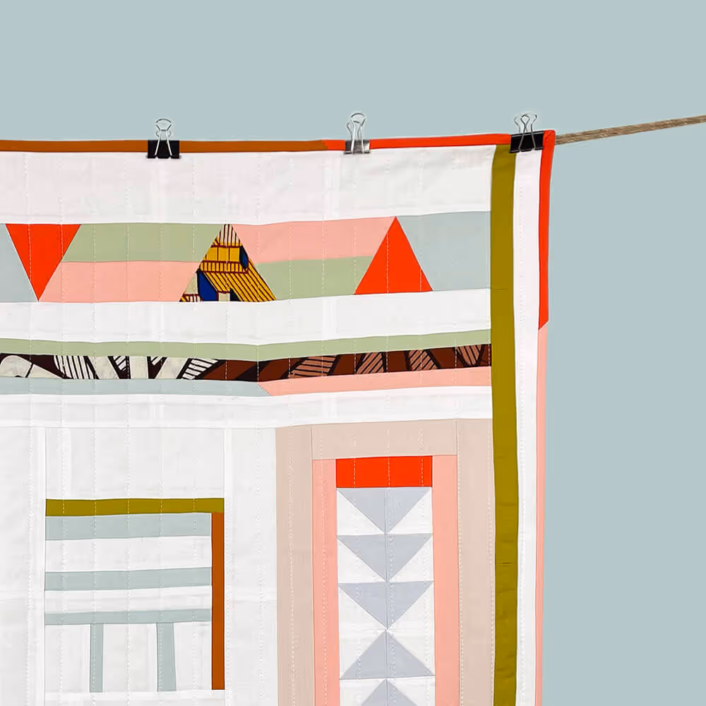
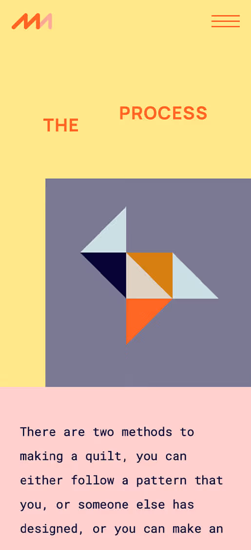
I liked the idea of using the existing shapes and patterns from the textile art to create bold graphic elements that could be incorporated into the branding to reinforce the personality and geometric feel to the brand.


I put together an information architecture based on client consultations that focused on the products and the process involved in creating them. I then took this architecture and content from the client to produce a lo-res wireframe prototype that could be used, tested and iterated upon to refine the user experience.

Once we had settled on the site architecture and wire-framed content I could then start putting the UI together. Using the content, colour palette, photography, graphic elements and typography I created a component based hi-res prototype in Figma that could be tested and iterated on multiple devices to further refine the user experience.
The finished website is fun, bold, unique, simple to use on any device and really makes the brand stand out in the world of textile art.
maquilts.com